Cheat Sheet: Maps, Waffles, WordCloud and Seaborn
Cheat Sheet : Maps, Waffles, WordCloud and Seaborn
Function | Description | Syntax | Example |
|
|---|---|---|---|---|
| Folium | ||||
| Map | Create a map object with specified center coordinates and zoom level. | folium.Map(location=[lat, lon], zoom_start=n) | world_map = folium.Map()canada =folium.Map(location=[56.130, -106.35], zoom_start=4) | 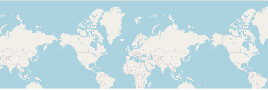 |
| Marker | Add a marker to the map with custom icon, popup, and tiles Tiles as Stamen Toner | folium.Marker(location=[lat , lon ],popup='Marker Popup',tiles='Stamen Toner').add_to(map) | folium.Marker(location=[556.130, -106.35], tooltip='Marker',tiles='Stamen Toner').add_to(world_map) |  |
| Tiles as Stamen Terrain | folium.Marker(location=[lat , lon ], popup='Marker Popup',tiles='Stamen Terrain').add_to(map) | folium.Marker(location=[556.130, -106.35], tooltip='Marker',tiles='Stamen Terrain').add_to(world_map) |  | |
| Circle | Add a circle to the map with specified radius, color, and fill opacity. | folium.features.CircleMarker(location=[lat, lon], radius=n, color='red', fill_opacity=n).add_to(map) | folium.features.CircleMarker(location=[56.130, -106.35], radius=1000, color='red', fill_opacity=0.5).add_to(world_map) |  |
| Chorpleth | Create a choropleth map based on a GeoJSON file and a specified data column. | folium.Choropleth(geo_data='path/to/geojson_file',data=df, columns=['region', 'value_column'],key_on='feature.properties.id', fill_color='YlGnBu', fill_opacity=0.7, line_opacity=0.2, legend_name='Legend').add_to(map) | world_map.choropleth(geo_data=world_geo, data=df_can, columns=['Country', 'Total'],key_on='feature.properties.name', fill_color='YlOrRd',fill_opacity=0.7,line_opacity=0.2,legend_name='Immigration to Canada') | 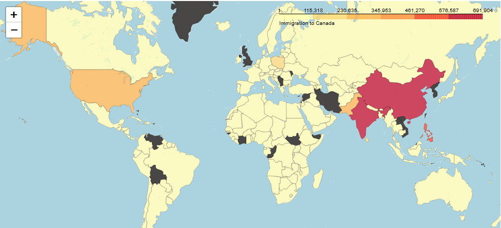 |
| PyWaffle | ||||
| Waffle | Create a waffle chart based on values and categories. | plt.figure(FigureClass = Waffle,rows = 20, columns = 30, values = values)waffle_chart = waffle.Waffle(values=[value1, value2, ...], rows=n, columns=n) | plt.figure(FigureClass = Waffle,rows = 20, columns = 30, values = df_dsn['Total'], cmap_name = 'tab20',legend = {'labels': label,'loc': 'lower left','bbox_to_anchor':(0,-0.1),'ncol': 3}) | 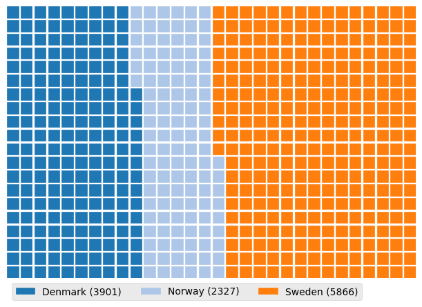 |
| Legend | Add a legend to the waffle chart. | waffle_chart.legend(loc='upper left', bbox_to_anchor=(1, 1)) | ||
| Title | Add a title to the waffle chart. | waffle_chart.set_title('Waffle Chart Title') | ||
| Labels | Add labels to the waffle chart. | waffle_chart.set_labels(['Label 1', 'Label 2', ...]) | ||
| WordCloud | ||||
| WordCloud | Create a word cloud object based on text data. | wordcloud = WordCloud().generate(text_data) | alice_wc = WordCloud(background_color='white', max_words=2000, mask=alice_mask, stopwords=stopwords)alice_wc.generate(alice_novel)plt.imshow(alice_wc, interpolation='bilinear') | 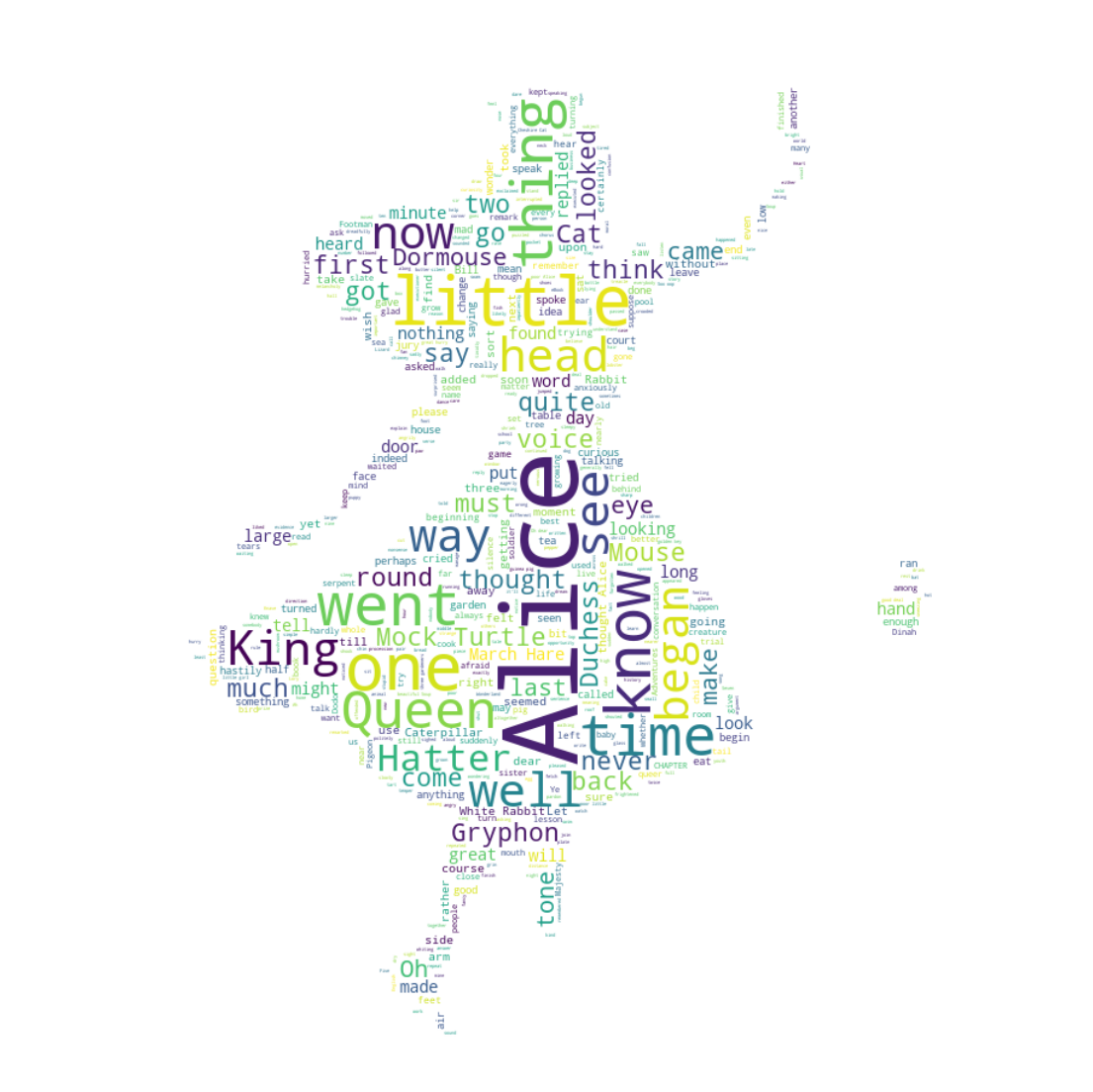 |
| Generate | Generate the word cloud based on the text data. | wordcloud.generate(text_data) | ||
| Display | Display the word cloud using matplotlib or other plotting libraries. | plt.imshow(wordcloud, interpolation='bilinear') | ||
| Options | Set various options for the word cloud, such as font, colors, mask, and stopwords. | wordcloud = WordCloud(font_path='path/to/font_file',background_color='white',colormap='Blues', mask=mask_image, stopwords=stopwords).generate(text_data) | ||
| Seaborn | ||||
| barplot | Create a bar plot to visualize the relationship between a categorical variable and a numeric variable. | sns.barplot(x='x_variable', y='y_variable', data=dataframe) | sns.barplot(x='Continent', y='Total', data=df_can1) | 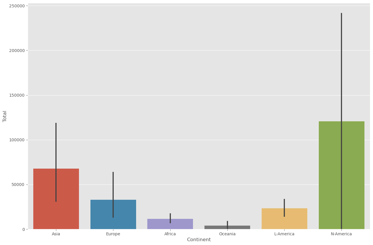 |
| countplot | Create a count plot to display the frequency of each category in a categorical variable. | sns.countplot(x='category', data=dataframe) | sns.countplot(x='Continent', data=df_can) | 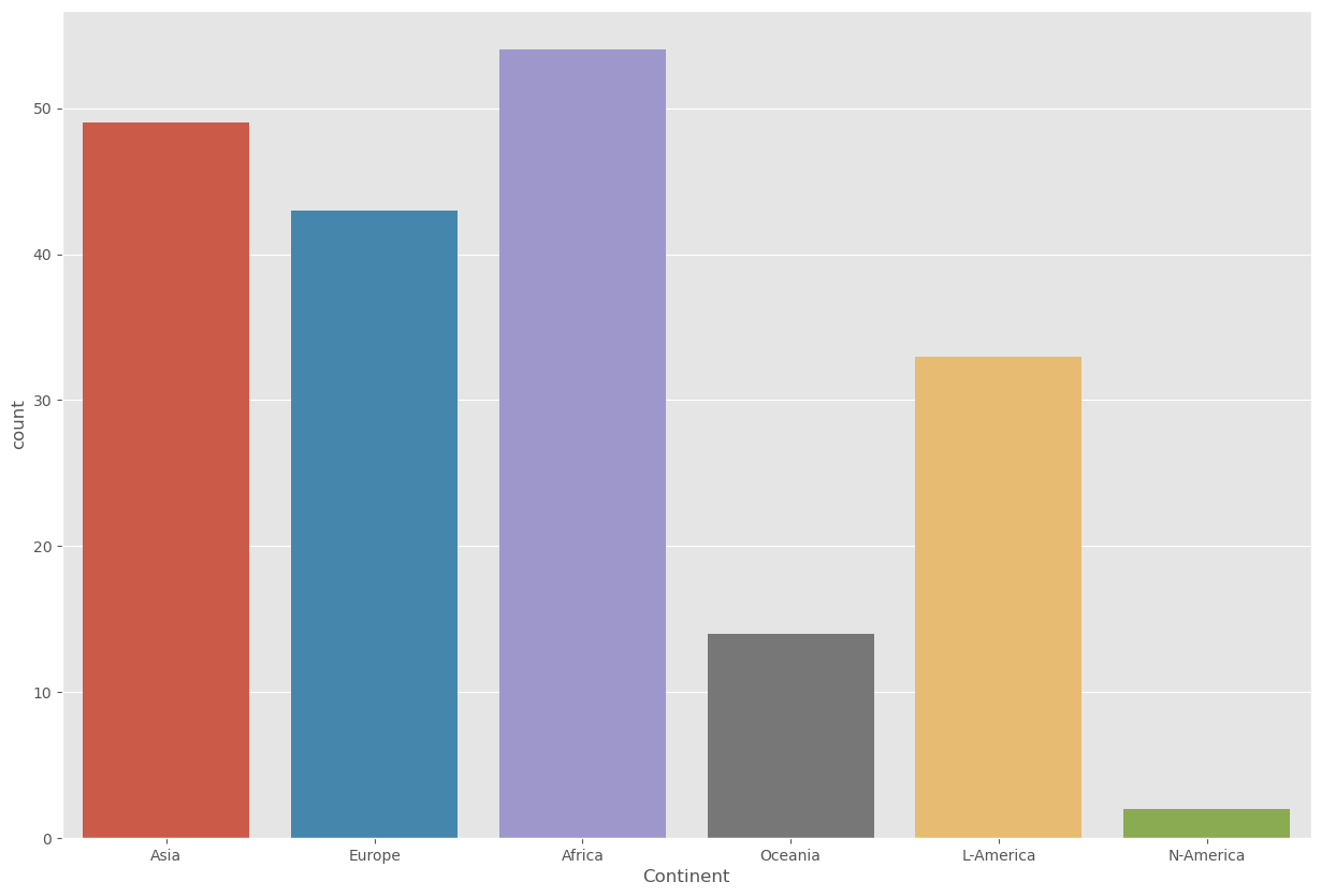 |
| regplot | Create a scatter plot with a linear regression line to visualize the relationship between two numeric variables. | sns.regplot(x='x_variable', y='y_variable', data=dataframe) | sns.regplot(x='year', y='total', data=df_tot) | 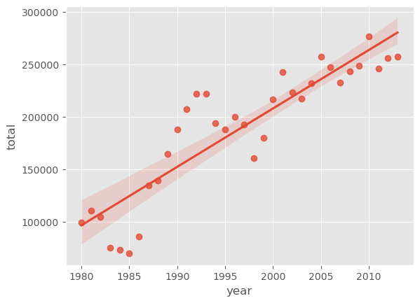 |

Comments
Post a Comment