Cheat Sheet: Plotting with Matplotlib using Pandas
Cheat Sheet : Plotting with Matplotlib using Pandas
Plot Type | Description | Pandas Function | Example | Visual |
|---|---|---|---|---|
| Line Plot | Shows trends and changes over time | DataFrame.plot.line()DataFrame.plot(kind = ‘line’) | df.plot(x=’year’, y=’sales’, kind=’line’) | 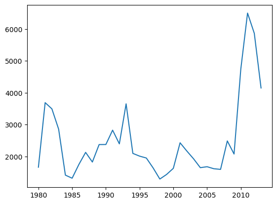 |
| Area Plot | Displays data series as filled areas, showing the relationship between them | DataFrame.plot.area()DataFrame.plot(kind = ‘area’) | df.plot(kind='area') | 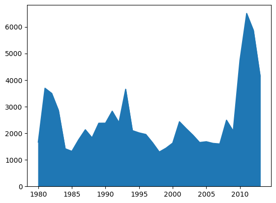 |
| Histogram | Displays bars representing the data count in each interval/bin | Series.plot.hist()Series.plot(kind = ‘hist’, bins = n) | s.plot(kind='hist', bins=10)df[‘age’].plot(kind='hist', bins=10) | 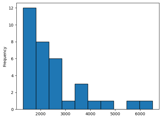 |
| Bar Chart | Displays data using rectangular bars | DataFrame.plot.bar()DataFrame.plot(kind = ‘bar’) | df.plot(kind='bar') | 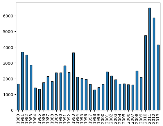 |
| Pie Chart | Displays data as a circular plot divided into slices, representing proportions or percentages of a whole | Series.plot.pie()Series.plot(kind = ‘pie’)DataFrame.plot.pie(y, labels)DataFrame.plot(kind = ‘pie’) | s.plot(kind='pie’,autopct='%1.1f%%')df.plot(x='Category',y='Percentage',kind='pie') | 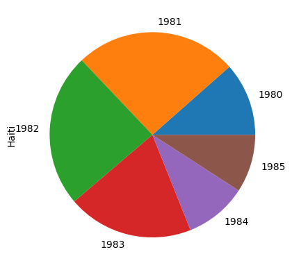 |
| Box Plot | Displays the distribution of a dataset along with key statistical measures | DataFrame.plot.box()DataFrame.plot(kind = ‘box’) | df_can.plot(kind='box') | 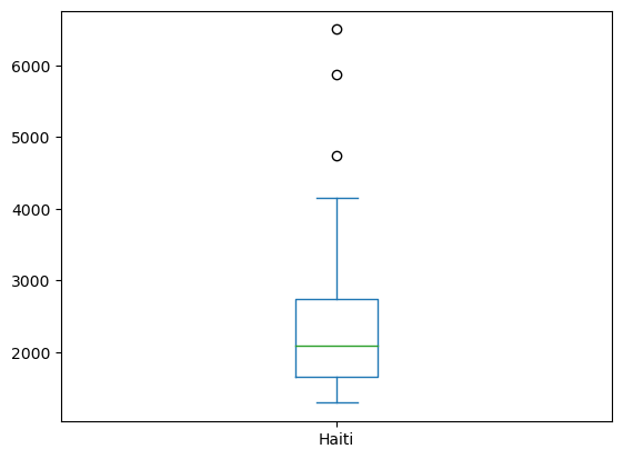 |
| Scatter Plot | Uses Cartesian coordinates to display values for two variables | DataFrame.plot.scatter()DataFrame.plot(x, y, kind = ‘scatter’) | df.plot(x='Height', y='Weight', kind='scatter') | 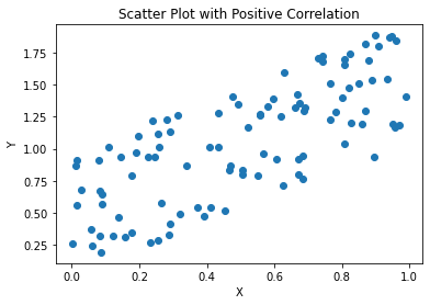 |
Cheat Sheet : Plotting directly with Matplotlib
Plot Type | Description | Matplotlib Function | Example | Visual |
|---|---|---|---|---|
| Line Plot | Shows trends and changes over time | plt.plot() | plt.plot(x, y, color='red', linewidth=2) | 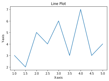 |
| Area Plot | Display data series as filled areas | plt.fill_between() | plt.fill_between(x, y1, y2, color='blue', alpha=0.5) | |
| Histogram | Displays bars representing the data count in each interval/bin | plt.hist() | plt.hist(data, bins=10, color='orange', edgecolor='black') | 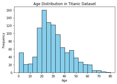 |
| Bar Chart | Displays data using rectangular bars | plt.bar() | plt.bar(x, height, color='green', width=0.5) | 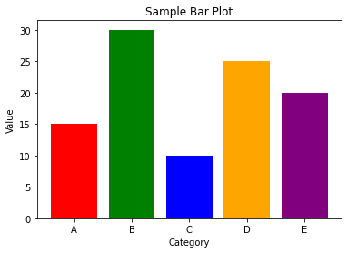 |
| Pie Chart | Displays data as a circular plot divided into slices, representing proportions or percentages of a whole | plt.pie() | plt.pie(sizes, labels=labels, colors=colors, explode=explode) | |
| Box Plot | Displays the distribution of a dataset along with key statistical measures | plt.boxplot() | plt.boxplot(data, notch=True) | 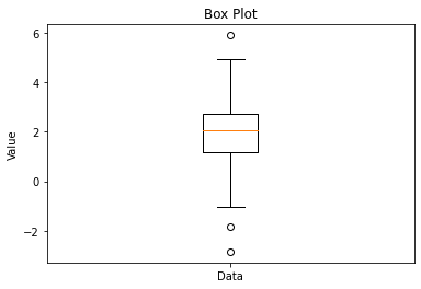 |
| Scatter Plot | Uses Cartesian coordinates to display values for two variables | plt.scatter() | plt.scatter(x, y, color='purple', marker='o', s=50) | 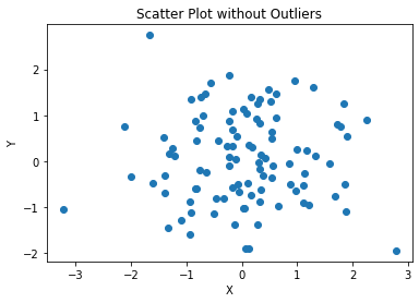 |
| Subplotting | Creating multiple plots on one figure | plt.subplots() | fig, axes = plt.subplots(nrows=2, ncols=2) | 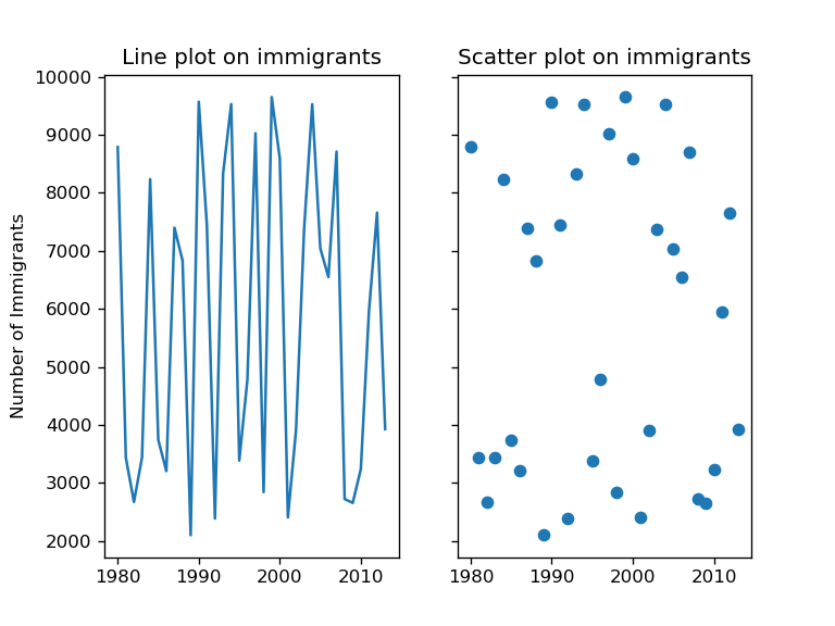 |
| Customization | Customizing plot: adding labels, title, legend, grid | Various customization | plt.title('Title')plt.xlabel('X Label')plt.ylabel('Y Label')plt.legend()plt.grid(True) | 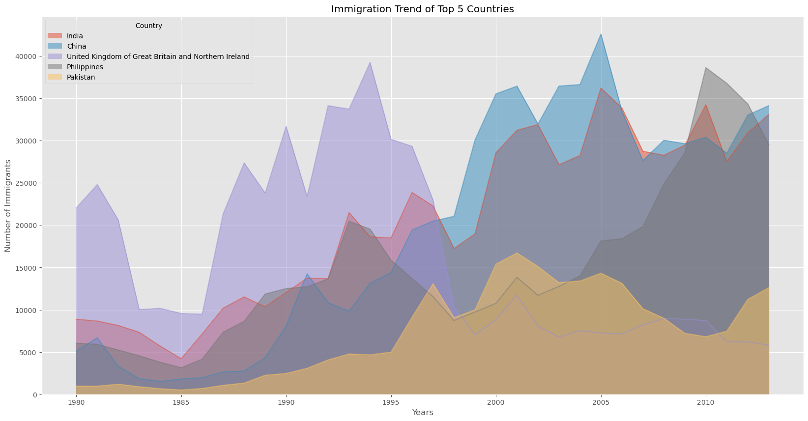 |
Comments
Post a Comment